
Every year, the design world holds its collective breath as Pantone unveils its Color of the Year, setting the tone (literally) for trends across industries. For 2025, that tone happens to resemble a rather familiar shade: Mocha Mousse. You might see it as the warm embrace of a luxurious, earthy neutral, while others… well, let’s just say the comparisons are inevitable.
Is it a groundbreaking choice that oozes sophistication, or has Pantone gone straight for the potty? Either way, this rich, chocolatey brown is about to color your world, whether you like it or not. Let’s dig in (figuratively, of course) and see if Mocha Mousse is truly the design world’s next obsession—or just a clever rebranding of something we all recognize from nature.

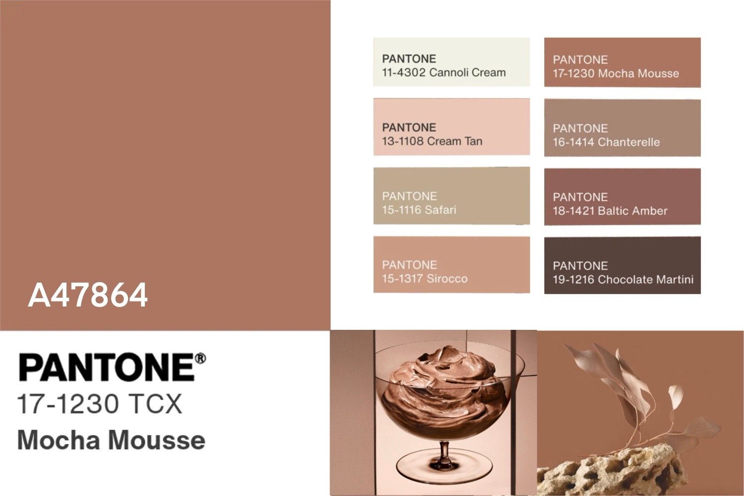
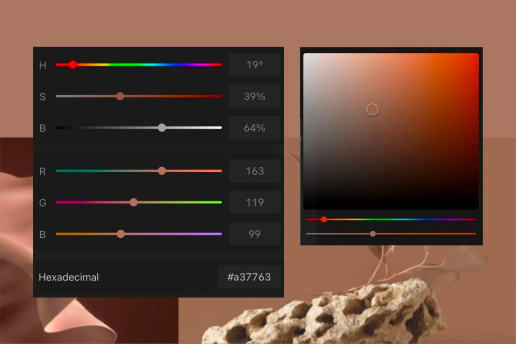
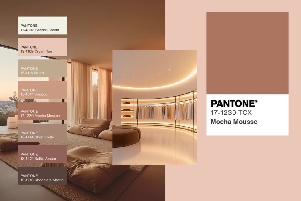
For 2025, Pantone has unveiled PANTONE 17-1230 Mocha Mousse—a rich, grounding brown that embodies warmth, comfort, and indulgence.
Why Does the Pantone Color of the Year Matter?
Since its inception in 1999, the Pantone Color Institute’s annual selection has become a pivotal moment in design culture. The chosen color reflects emerging trends and highlights the impact of color in art, design, and daily life. Beyond its aesthetic appeal, the Color of the Year serves as a unifying thread that shapes creativity and innovation across industries.
2025: Mocha Mousse Takes the Spotlight
Mocha Mousse, a deep, earthy brown, captures a sense of simplicity and sophistication. Its warm, neutral tone invites a feeling of connection and comfort, making it a versatile choice for a range of design applications. From cozy interiors to bold fashion statements, this shade offers endless possibilities for creative expression.

Pantone’s collaborations are already bringing Mocha Mousse to life. Joybird, known for its stylish interiors, is incorporating the shade into its palettes, offering a warm, grounding base for any room. Meanwhile, Motorola’s latest designs feature a vegan leather finish in Mocha Mousse, showcasing the color’s timeless elegance.
The Resurgence of Earthy, Neutral Tones in Design Trends
Over the past few years, earthy, neutral tones have taken centre stage in design trends across industries. These shades, often inspired by nature, have become a staple in interior design, fashion, and branding, reflecting a collective desire for grounding, timeless aesthetics. Mocha Mousse, Pantone’s Color of the Year 2025, is the latest addition to this evolving palette, perfectly encapsulating the essence of this movement.
Earthy Tones and the Shift Toward Sustainability
The growing emphasis on sustainability has significantly influenced design choices. Consumers and creators alike are seeking designs that evoke a sense of connection to the natural world. Earthy colors like Mocha Mousse mirror the hues found in soil, wood, and stone, creating a visual language that feels organic and rooted. These tones inherently encourage a return to simplicity and mindfulness, aligning perfectly with eco-conscious values.
Neutral Colors as a Canvas for Wellness
Wellness has also emerged as a central theme in modern design, and neutral colors play a crucial role in fostering calm, balanced environments. Mocha Mousse, with its rich, soothing brown hue, offers a sense of warmth and stability. Its versatility makes it an ideal choice for spaces and designs intended to promote relaxation, such as wellness retreats, minimalist interiors, or even branding for self-care products.
Why Mocha Mousse Fits the Trend
Mocha Mousse is a modern interpretation of earthy sophistication. Its rich brown tone embodies both the tactile allure of natural materials and the understated elegance of neutral palettes. It’s a color that speaks to the broader cultural yearning for authenticity, simplicity, and connection—values that have reshaped how we approach design.
By embracing Mocha Mousse and similar tones, designers can tap into this cultural shift, creating work that resonates deeply with audiences. Whether it’s through branding, interiors, or wearable design, these earthy hues remind us of our place in the natural world while offering a sense of comfort and timelessness.
How Is the Pantone Color of the Year Chosen?
The selection process is a meticulous blend of research and artistry. Each year, a panel of Pantone experts analyzes global influences, drawing inspiration from pop culture, film, fashion, technology, and scientific advancements. These insights culminate in a color that reflects the spirit of the times and resonates across industries.
What do you think of the colour? Let me know in the comments!